


We celebrated the official presentation of the new line at the ISM in Cologne and the response was great! We got spontaneous praise from all sides. Especially gratifying: many new listings for our wonderful products.
Petra Kneipp, CEONew brand and packaging design for Schwermer, a fine confectionery brand with a wide assortment of chocolate delights in Allgäu.
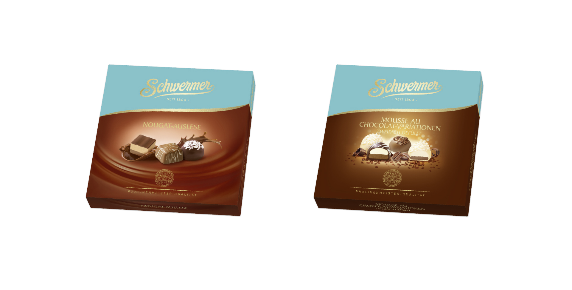
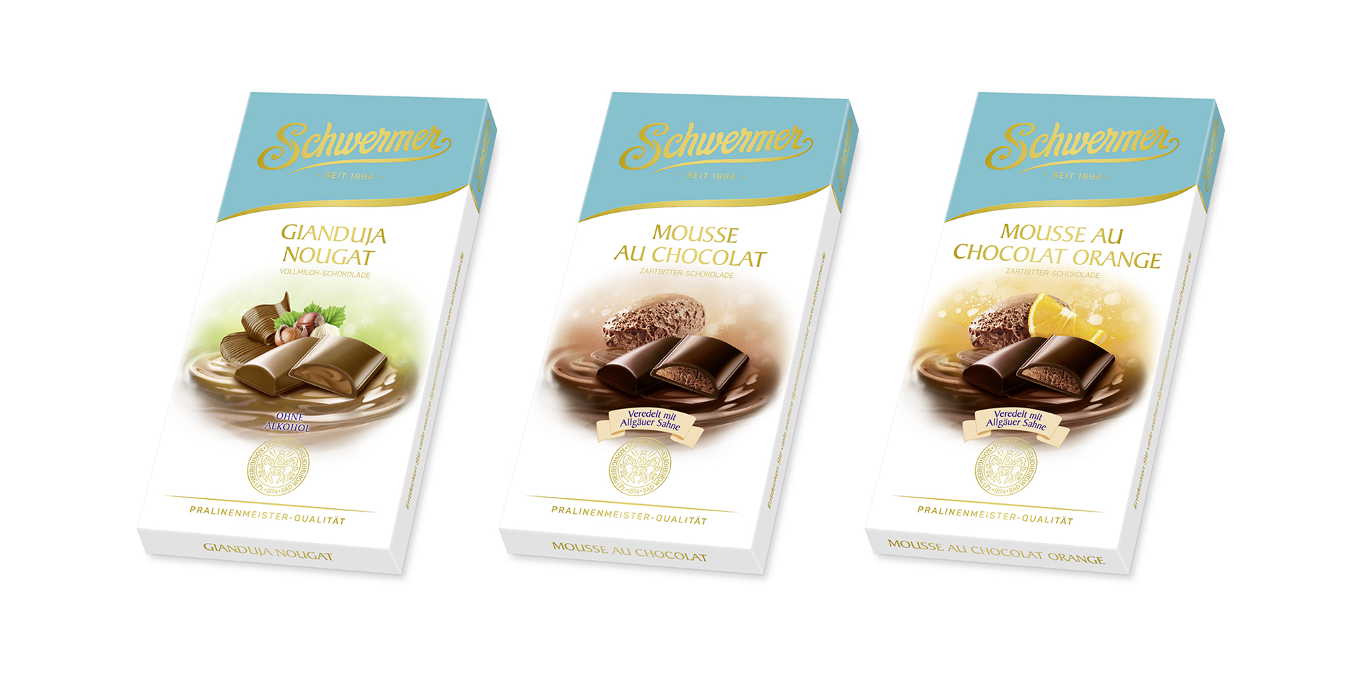
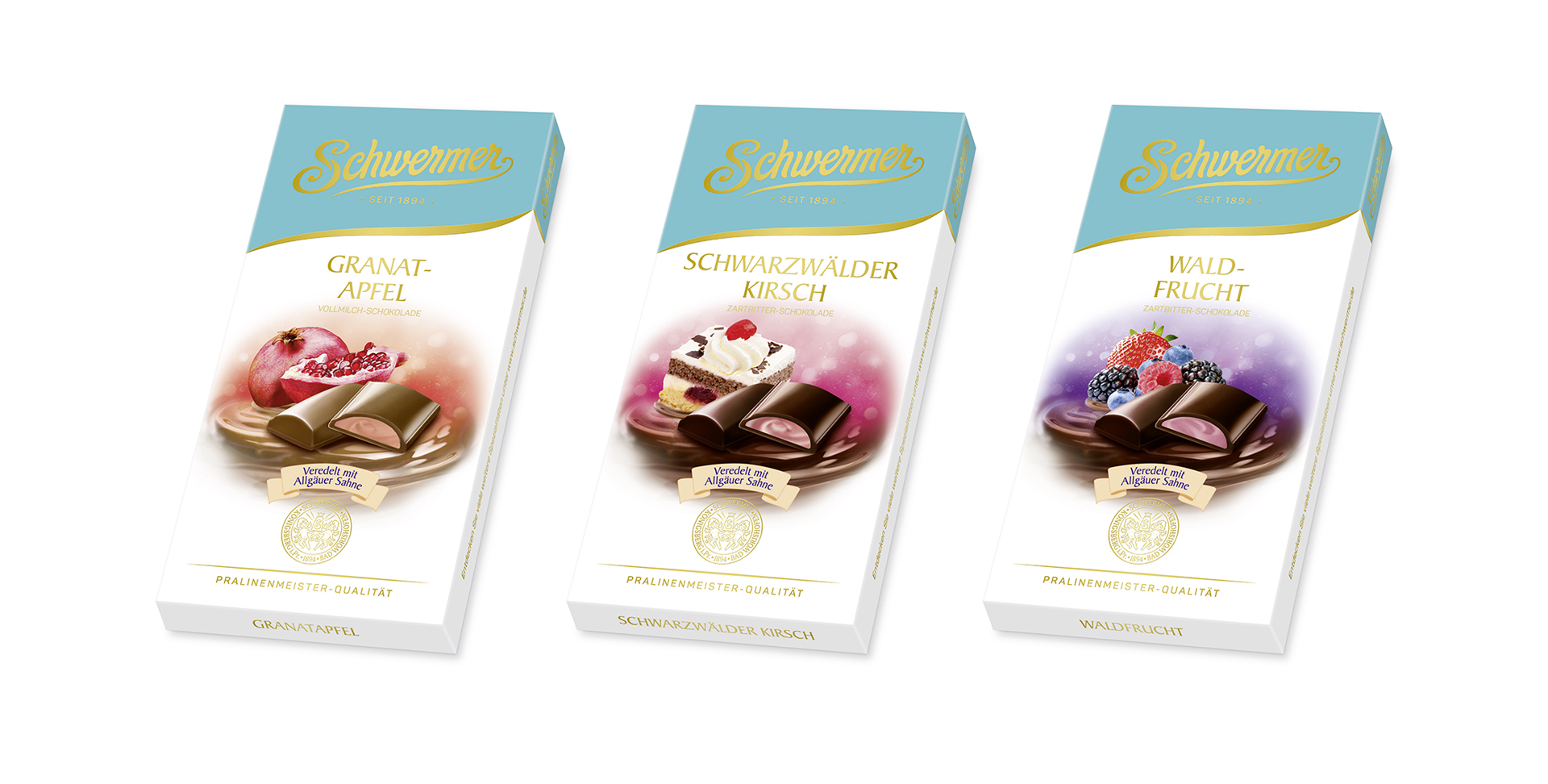
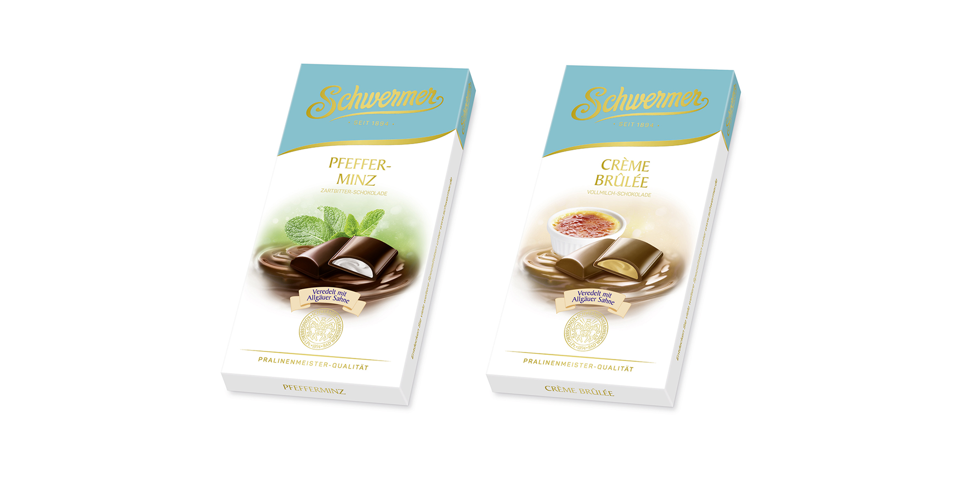
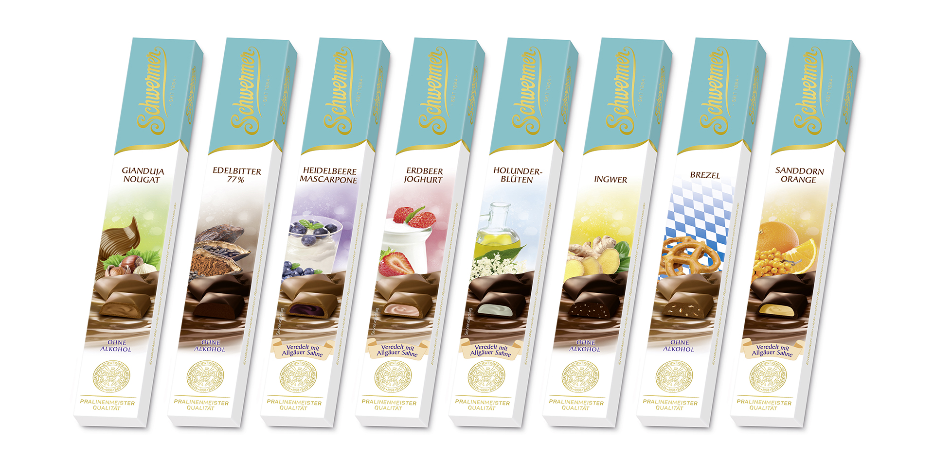
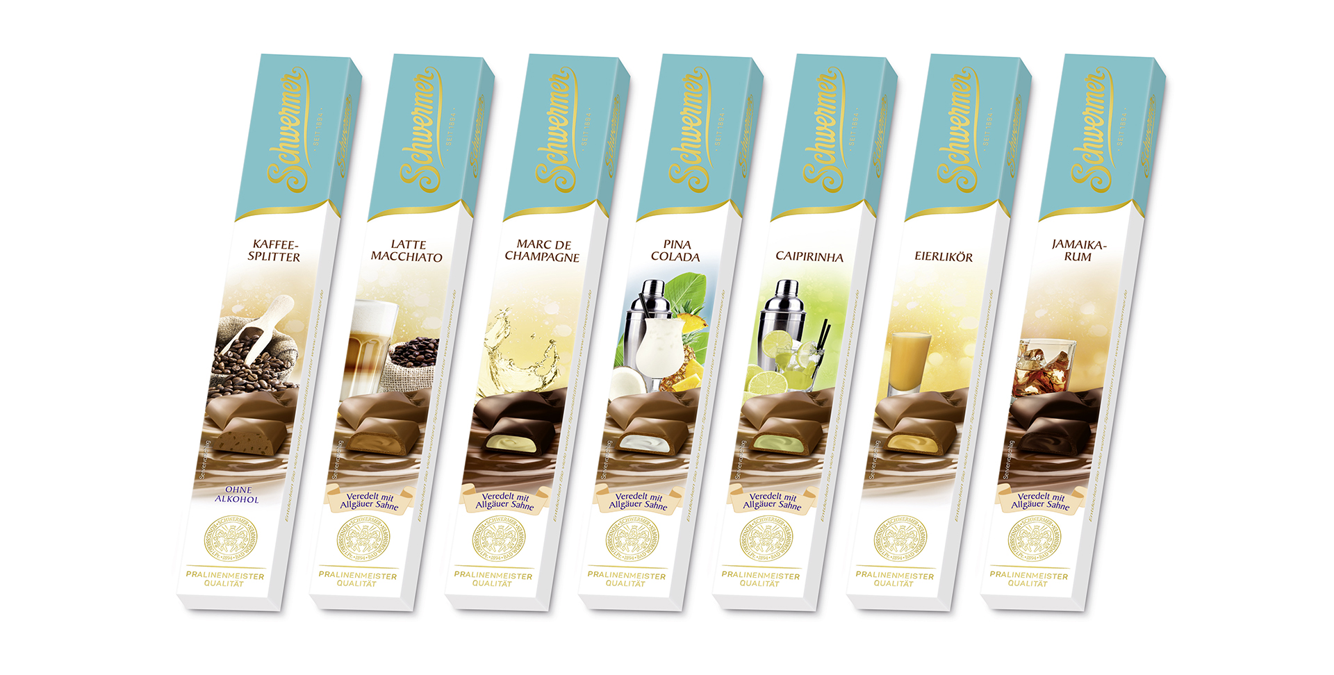
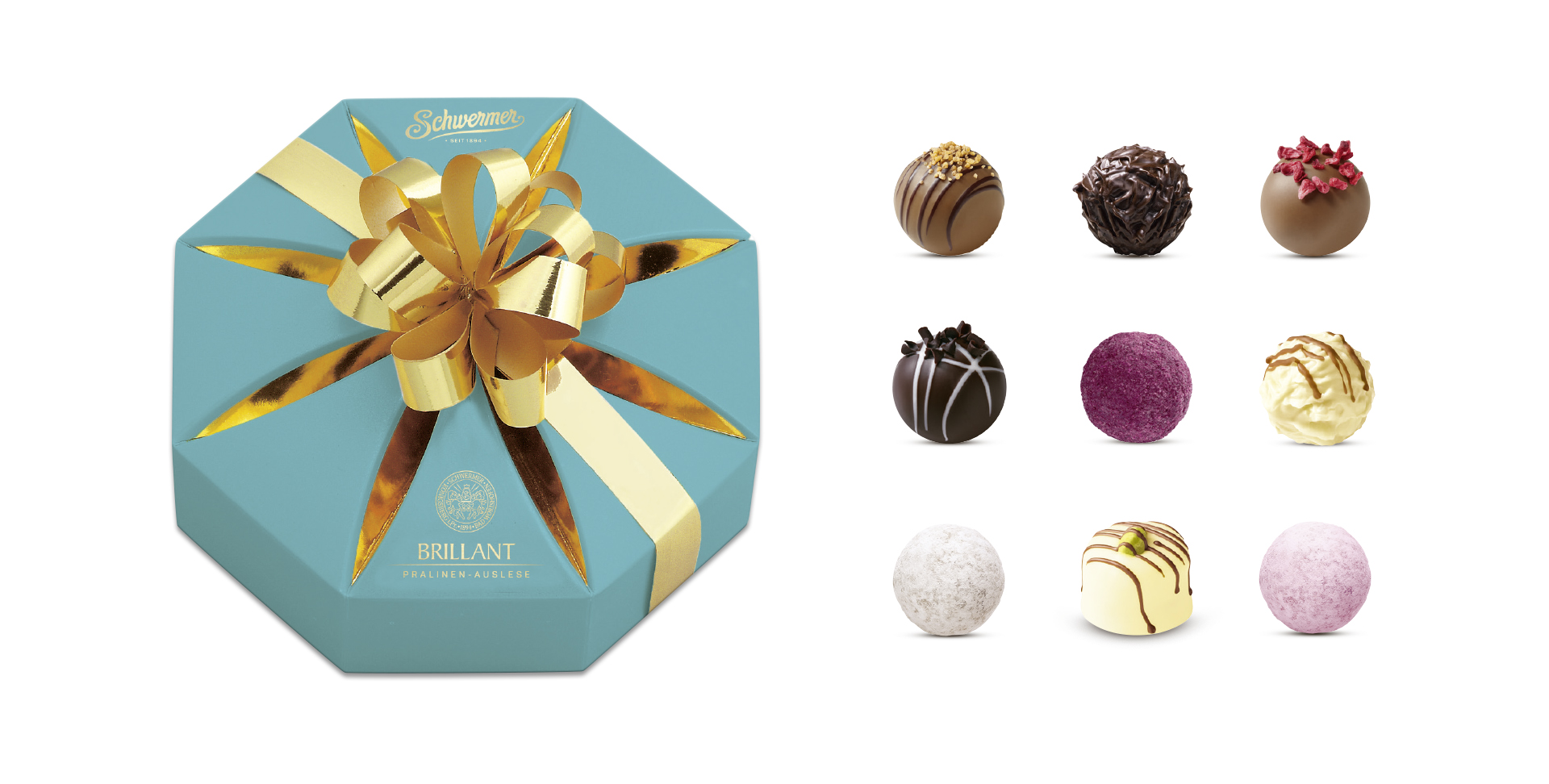
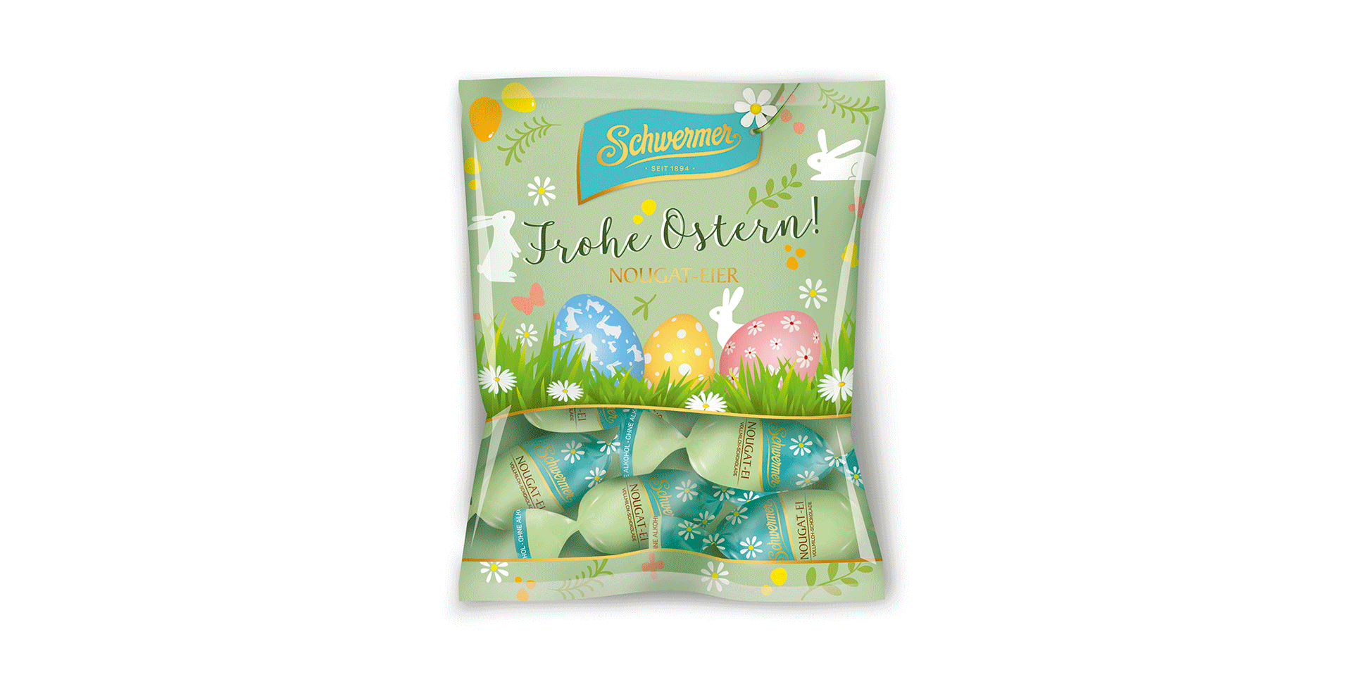
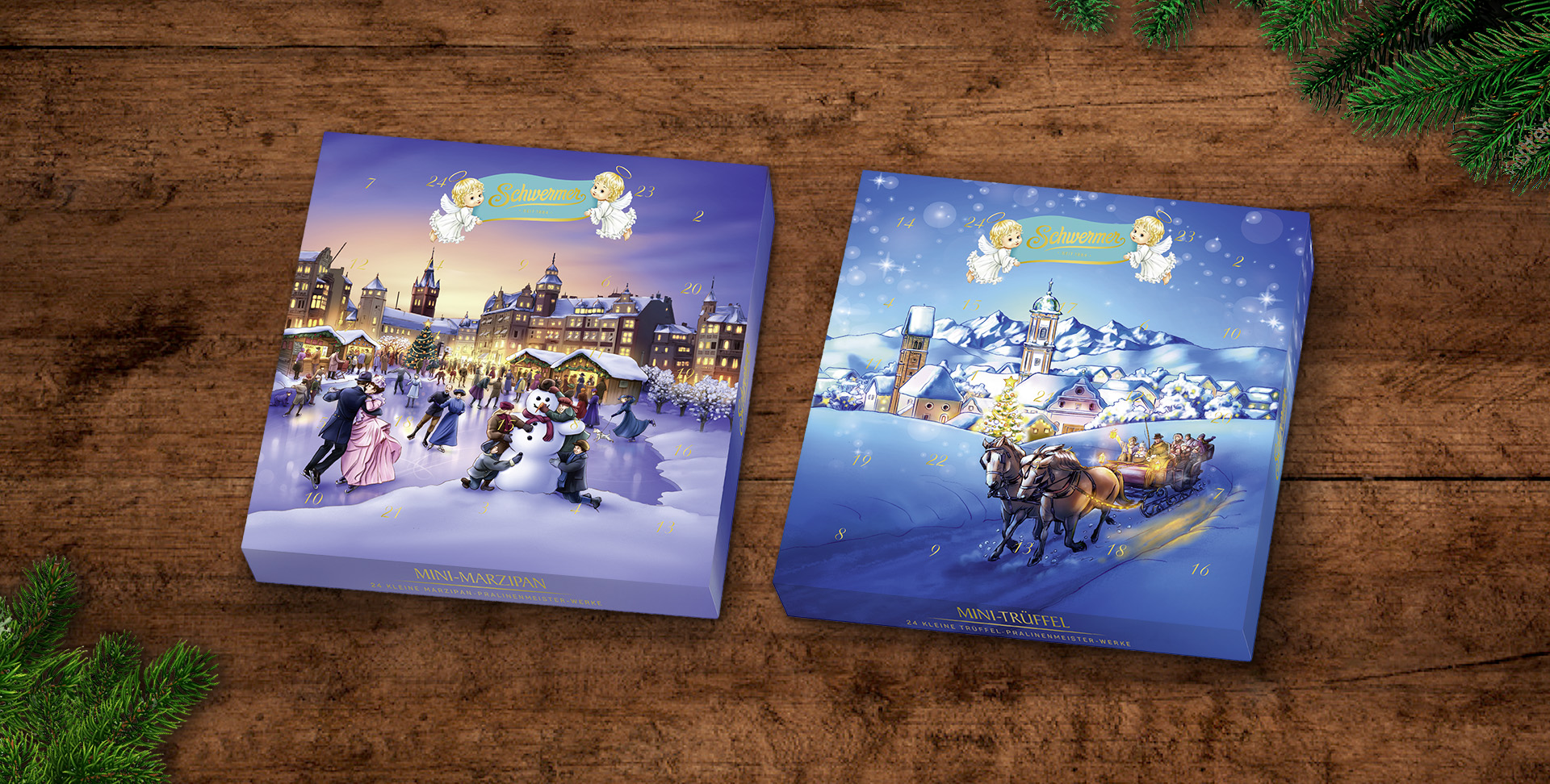
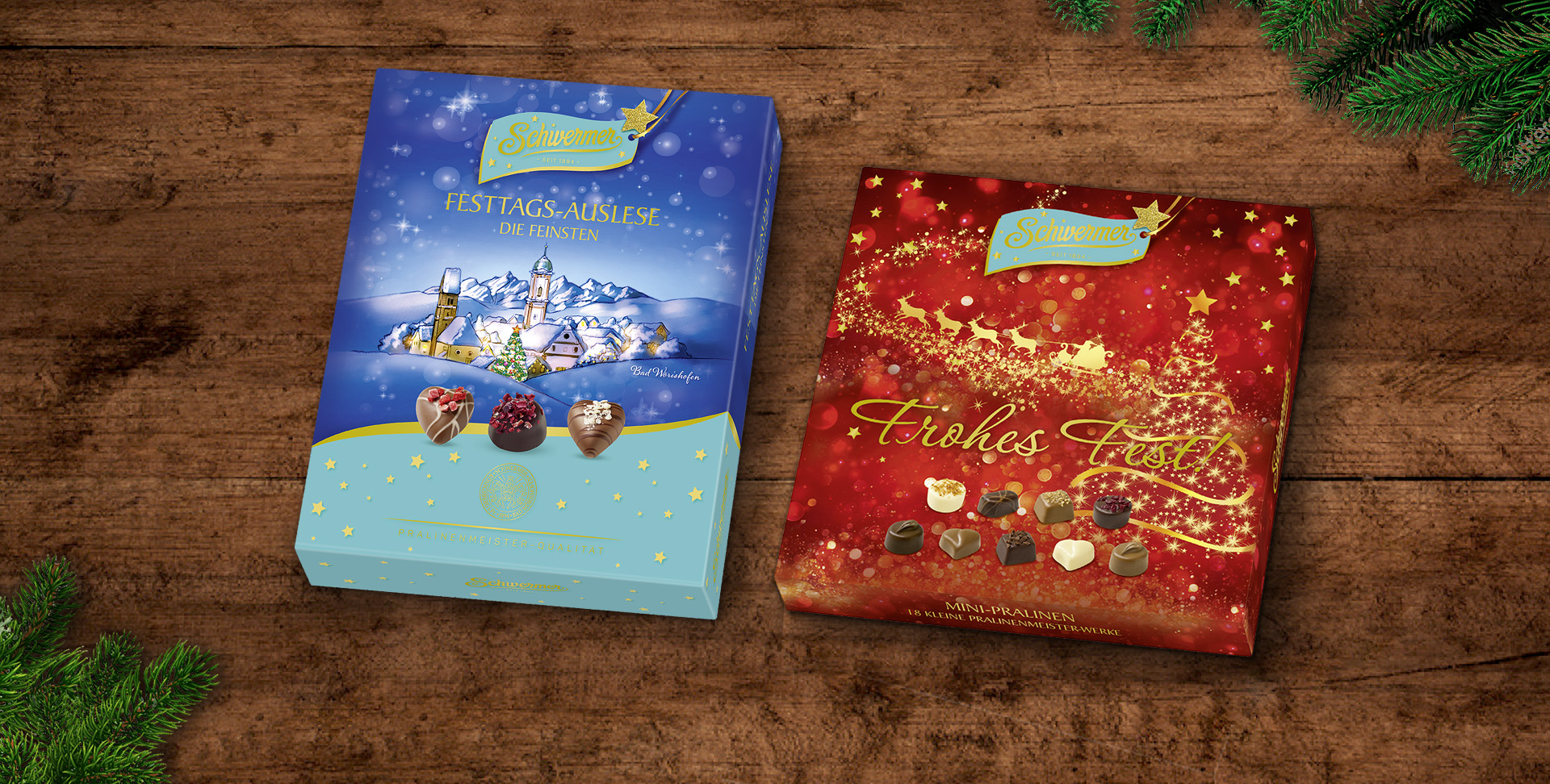
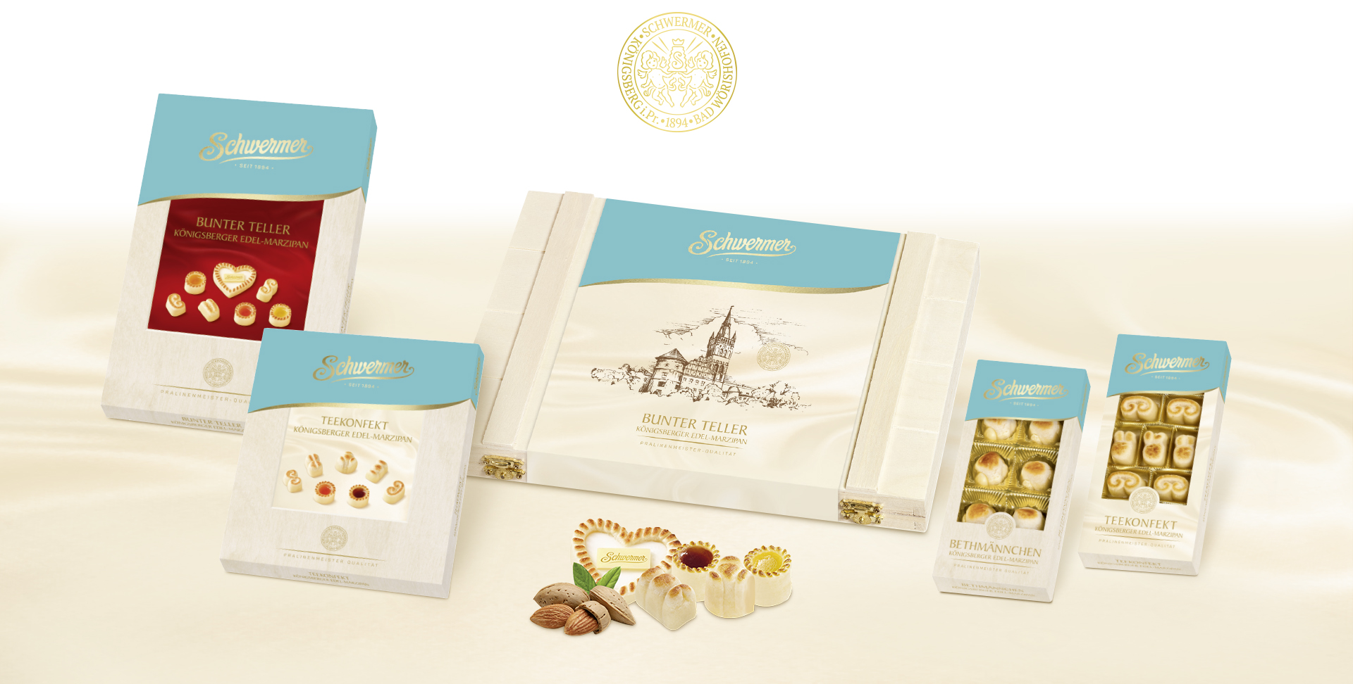
The aim of our relaunch was to give the delicious chocolate products a high quality brand and packaging appearance to match the quality of the products. Thus, Schwermer will also spark new target groups.
All design elements have been redefined. First, the brand lettering: Soft flowing shapes, like cast from chocolate, whet one’s appetite for sweets.
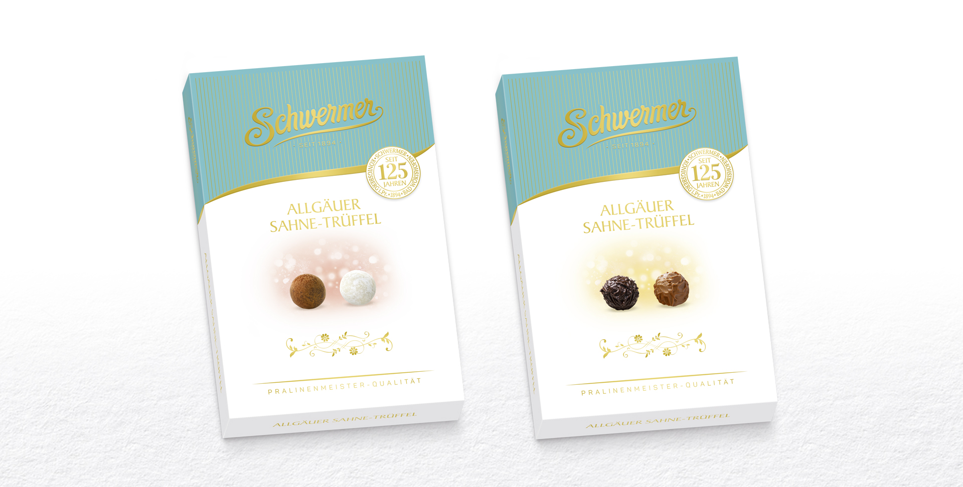
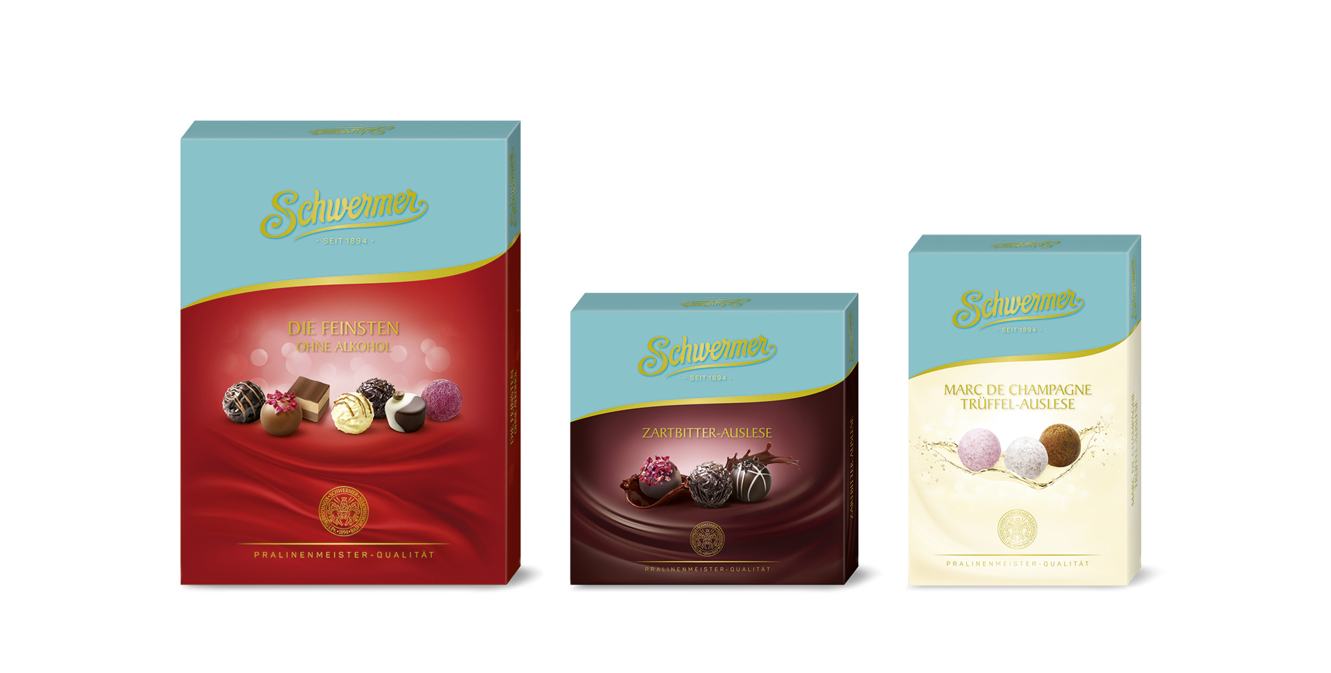
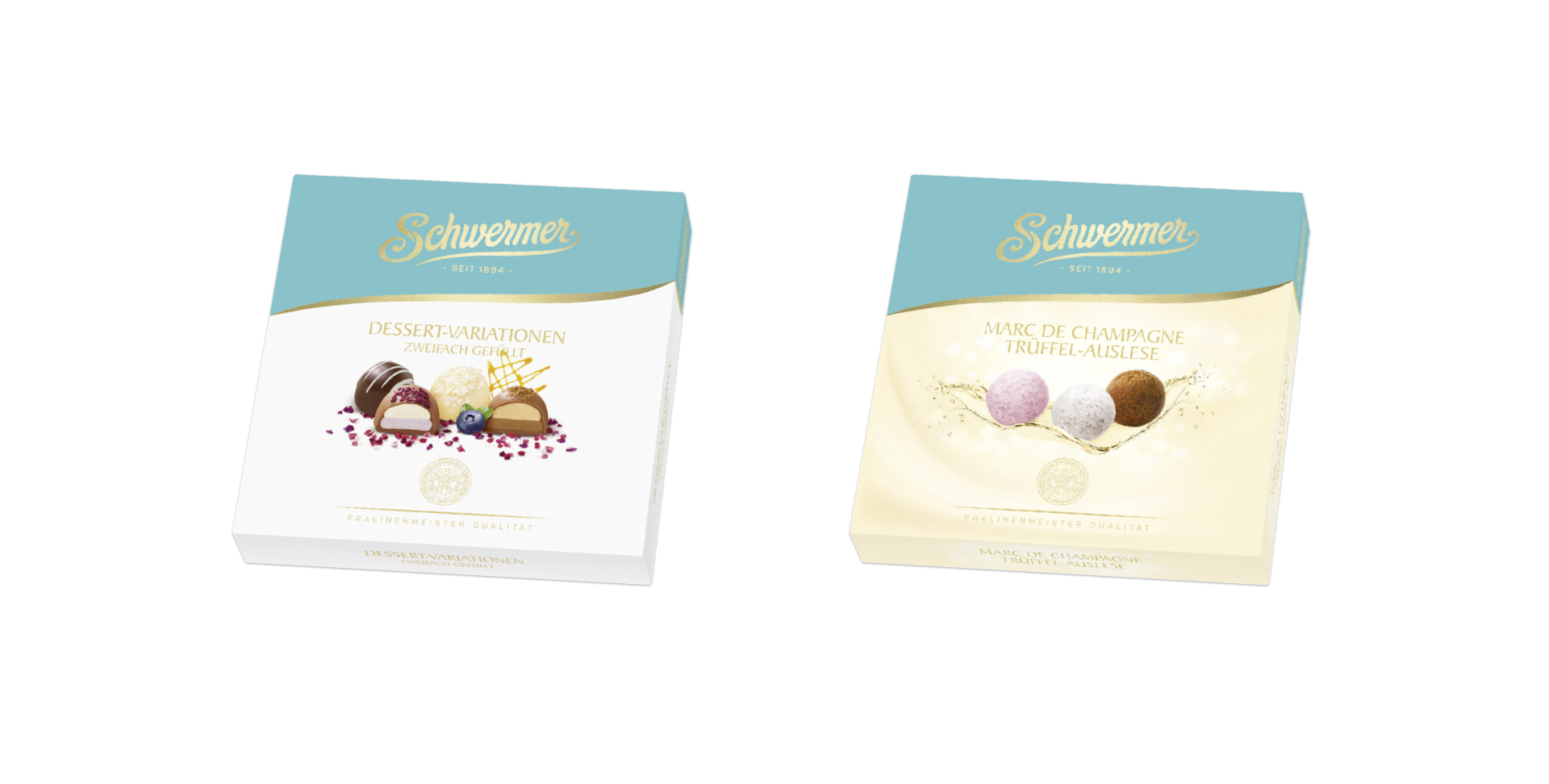
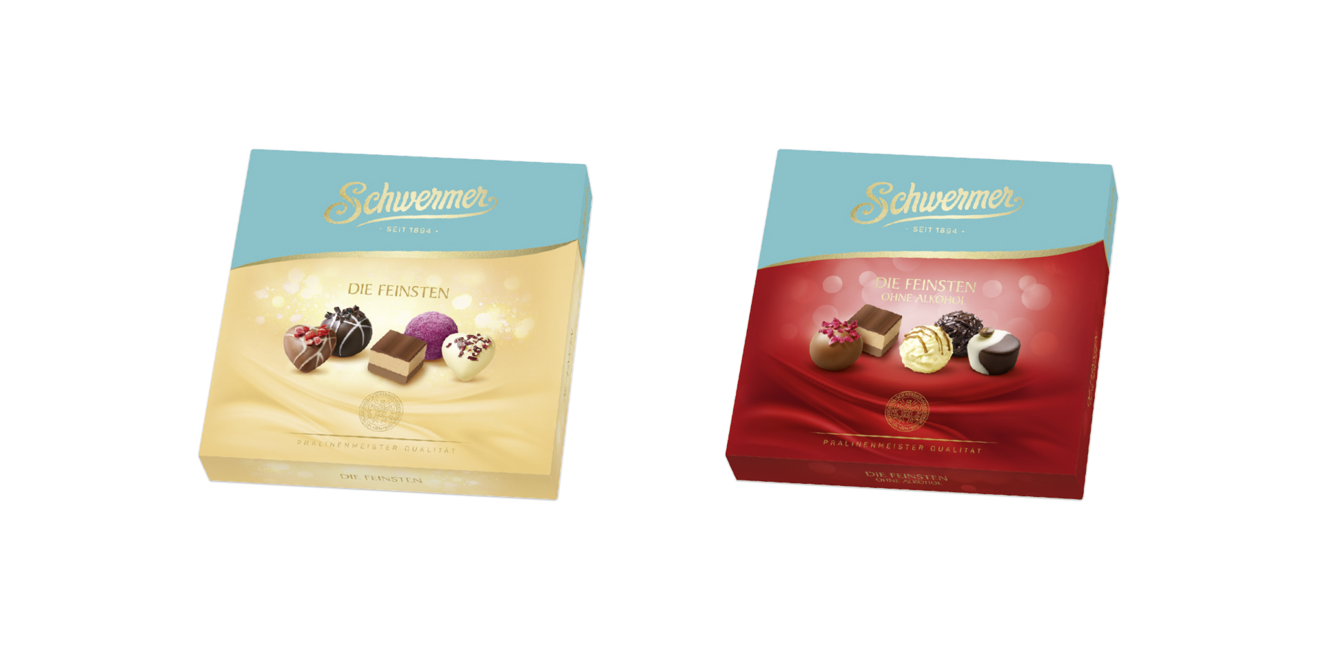
An important decision to score in the future with a stronger block on the shelf: The new key color for Schwermer: The "Schwermer turquoise" in combination with the golden Schwermer brand lettering gives the whole range an unmistakable and particularly premium appearance.
With the portrait of the company founder Henry Schwermer the brand also gets a face and content for the interesting story of origin.
The quality seal, which distinguishes each pack, is derived from an old motif of the “Gründerzeit” in Königsberg.
HEIDI CHOCOLAT SCHWERMER GmbH
BRAND STRATEGY
BRAND DESIGN
PACKAGING DESIGN
CORPORATE DESIGN
We celebrated the official presentation of the new line at the ISM in Cologne and the response was great! We got spontaneous praise from all sides. Especially gratifying: many new listings for our wonderful products.
Petra Kneipp, CEO