
THE POWER OF DESIGN
PROVIDES TRUST
AND SYMPATHY
WIENER STÄDTISCHE
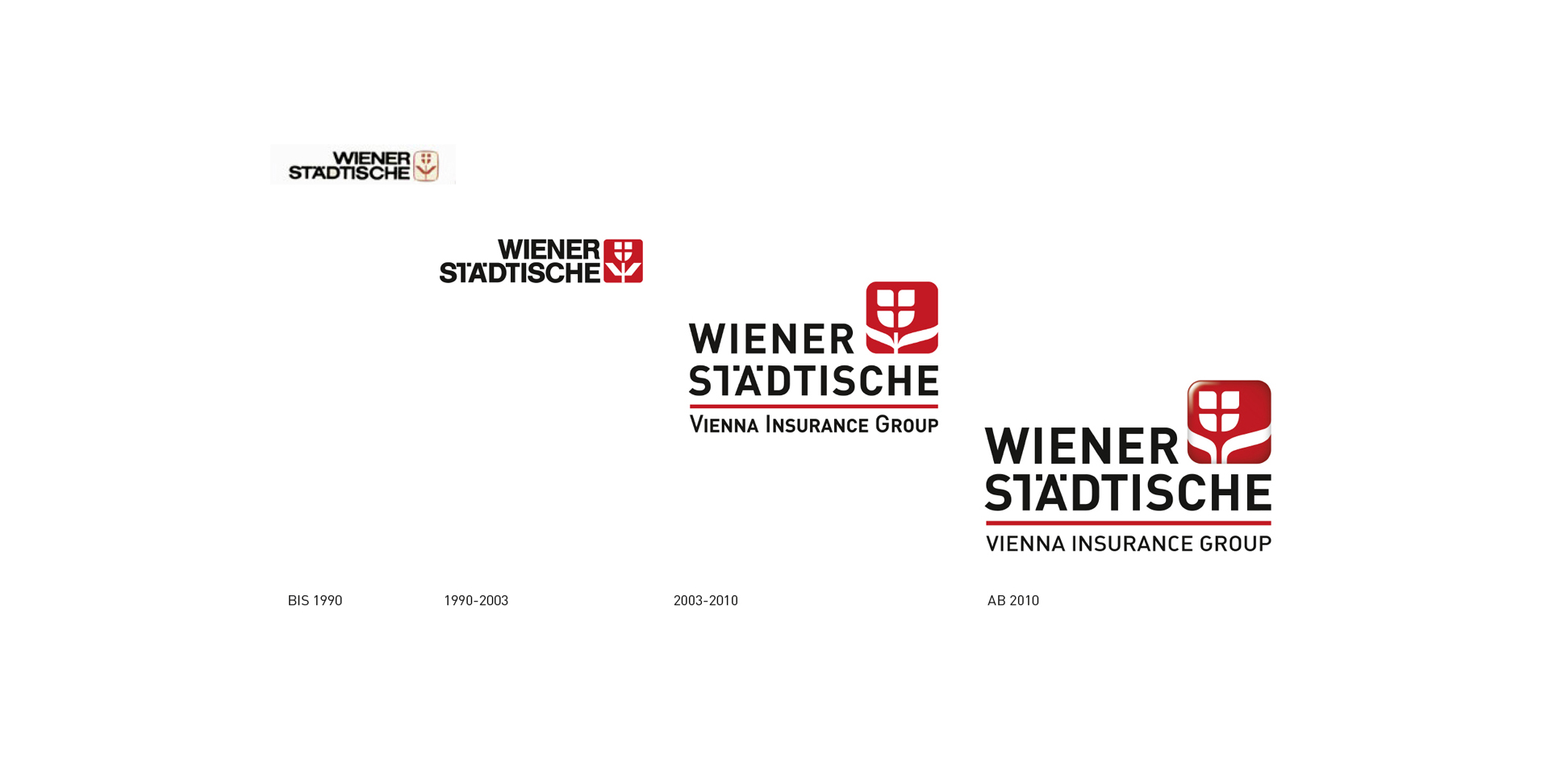
Design and redesign of the traditional brand for Wiener Städtische Versicherung. The design process ran in 3 stages and took over 20 years. The particular challenge for us was to maximize the avoidance of cognitive dissonance while preserving the continuity and deepening of the basis of trust to Austria's best-known insurance company.
Wiener Städtische Versicherungs Group is one of Austria's most well known and recognized brands today. The redesign steps of the layout were not consciously perceived by most Austrians, the transition succeeded harmoniously and fluently.
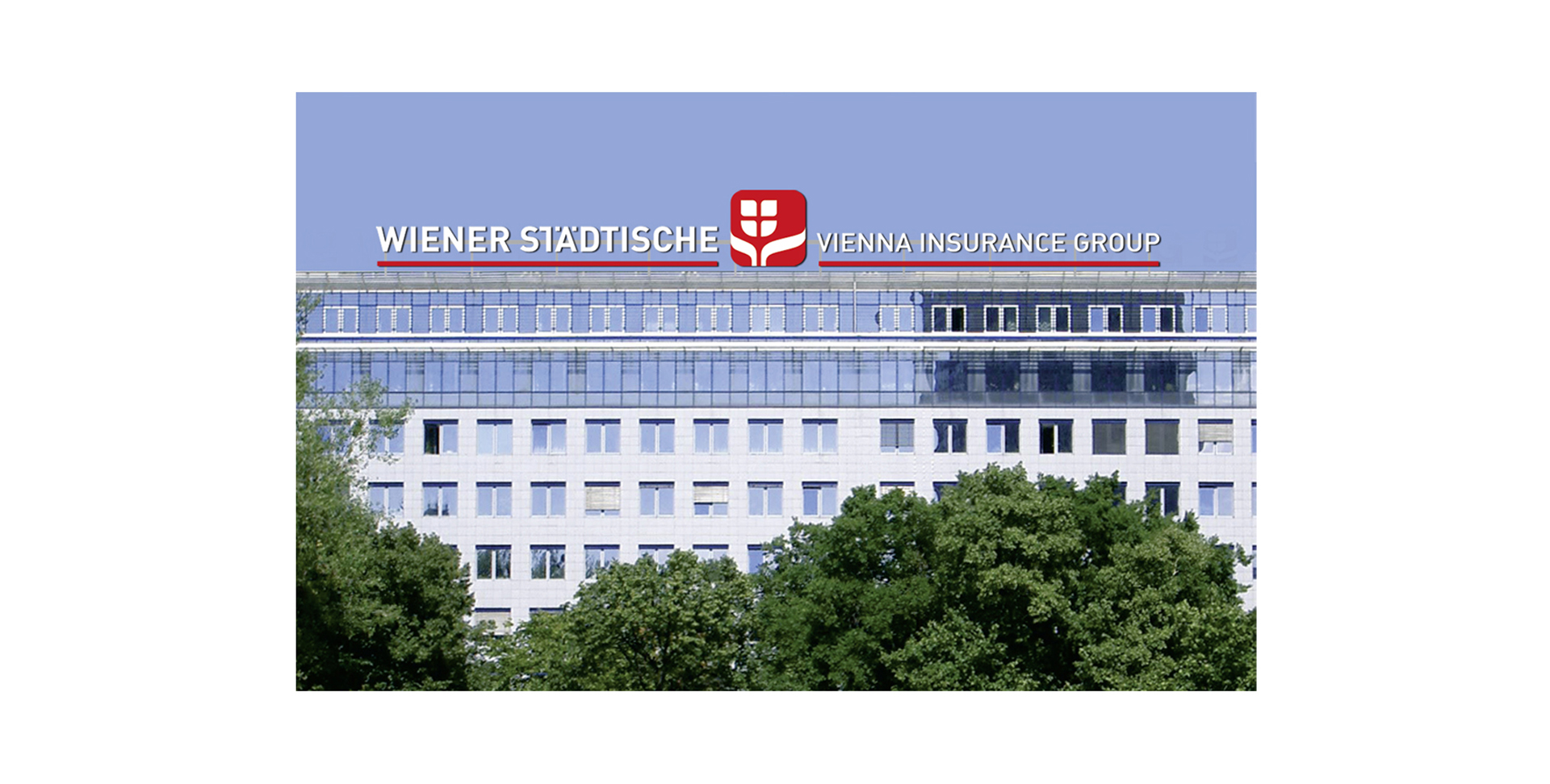
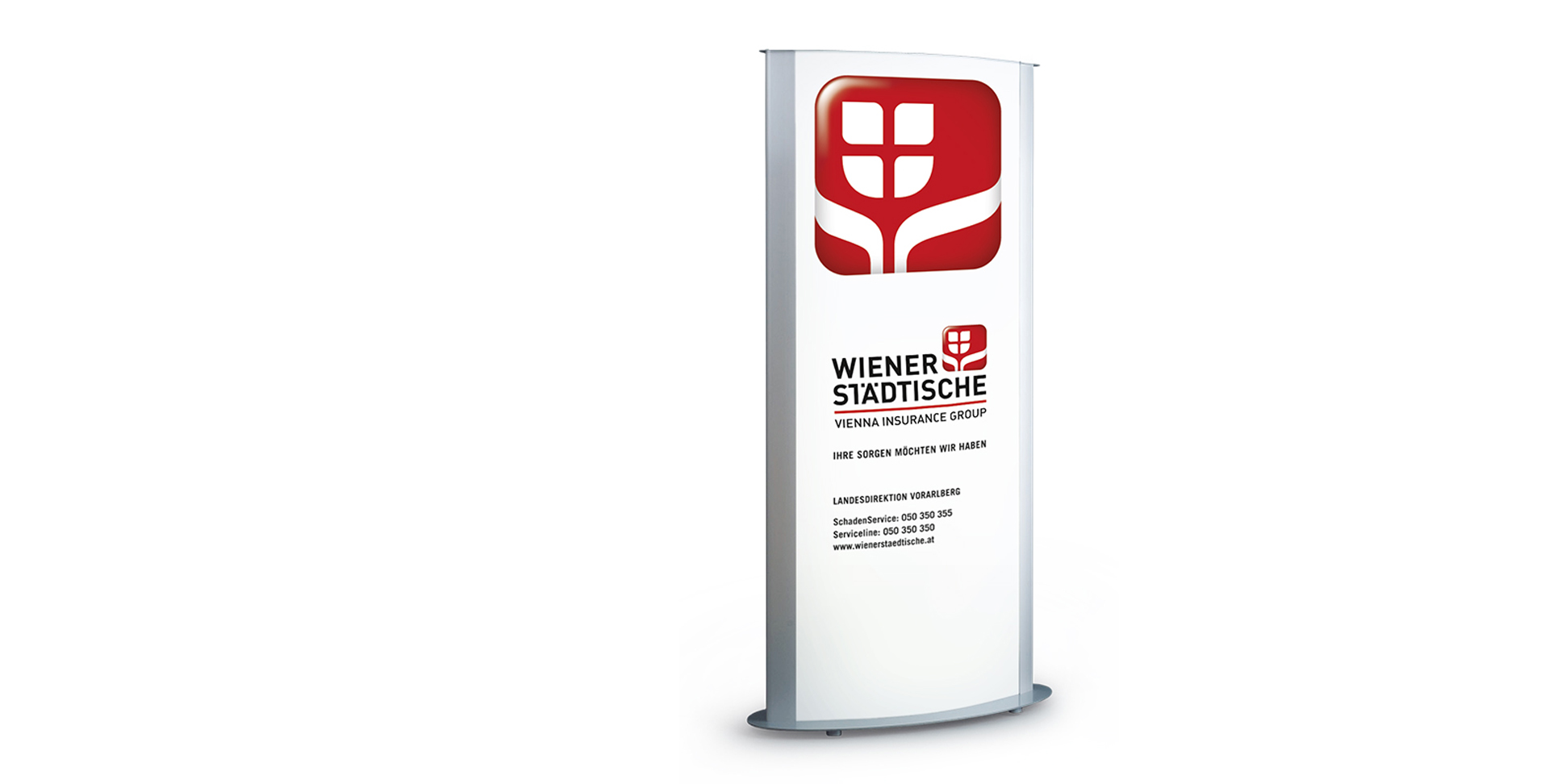
The central brand element of the tulip changes in the course of the transition from the very strict geometric shape to soft, flowing lines and the symbolism of the tulip leaves gives the whole logo a whole new meaning - the protective hands are definitely the most essential aspect of the insurance idea. An extensive CD manual sets out all the design guidelines that characterize the image of Wiener Städtische: the color world, the typography, the interior and exterior appearance of the brand.
Customer:
WIENER STÄDTISCHE VERSICHERUNG AG
What we have done:
BRAND STRATEGY
BRAND DESIGN
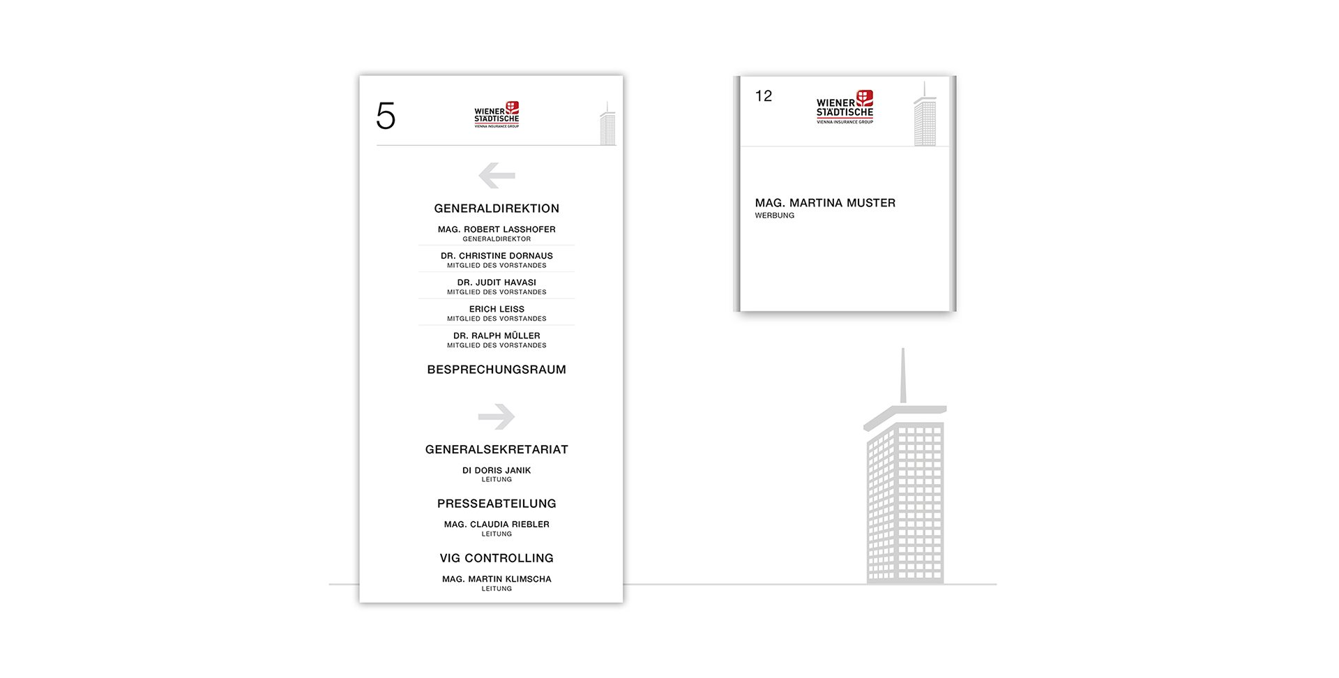
CORPORATE DESIGN
OUR SUCCESSFUL COOPERATION HAS BEGUN MORE THAN TWO DECADES AGO, AND ALSO TODAY MARK & MARK HAS DELIGHTED WITH MUCH KNOW-HOW AND A GREAT PORTION CREATIVITY.
SABINE TOIFL, HEAD OF ADVERTISING & SPONSORING