Eerily beautiful Halloween Packaging Design for Kelly’s!
25. October 2017
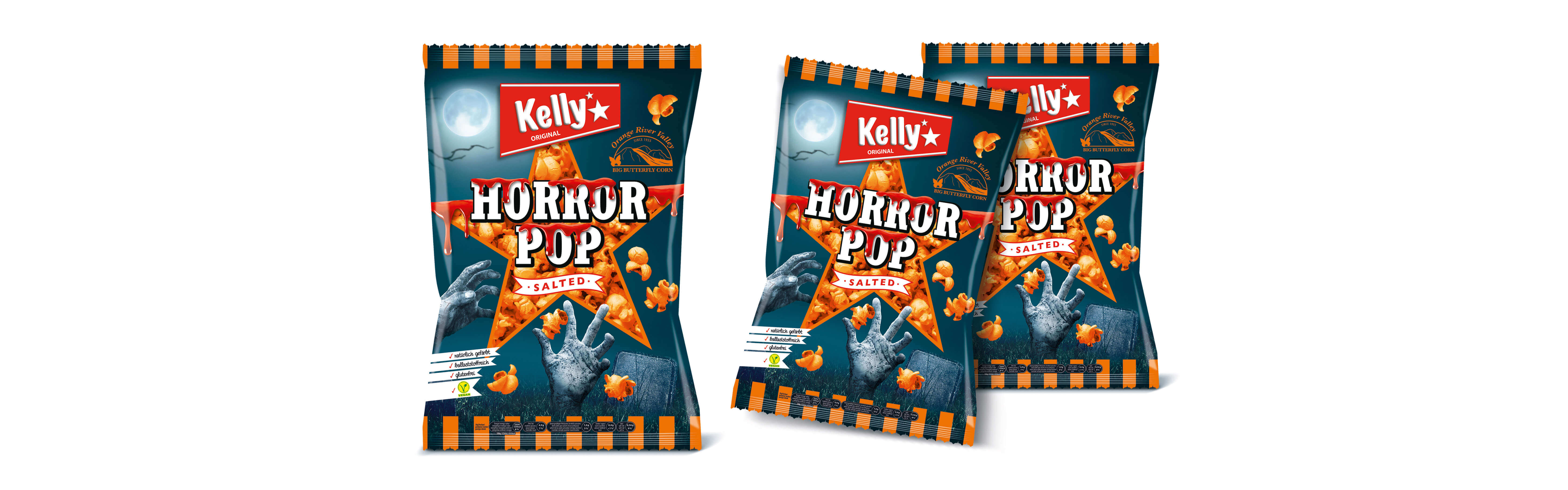
Now new in the sortiment: Kelly’s HorrorPopcorn, fresh from the design agency MARK & MARK.
Kelly’s launches a salty Halloween popcorn product for the first time.
MARK & MARK are responsible for the “scary-spooky” design of this Limited Edition. The Kelly’s “HorrorPop” is bright orange and classic salted and speaks through its packaging design to “halloween enthusiastic” consumers who are in search of the perfect gift for a Halloween party.
Mag. Maria Bauernfried, Marketing Manager of Kelly’s, commented on the new HorrorPop product as follows: “With the unique product color and the eye-catching packaging, the unique, salty Halloween popcorn product is being offered on the Austrian market for the first time. The unique Halloween character is particularly evident – the package is really an eye-catcher at the POS and is also very different from our Kelly’s Spookies.”
“Matching the package, we have also developed the scary outer box design. The new “HorrorPop” will delight young and old on Halloween, because it tastes really delicious,” says Ursula Mark, CEO and Creative Director of MARK & MARK.