A new design for the cult brand TIXO®!
6. December 2018
Mark & Mark Design Agency creates new brand and packaging design for the Austrian adhesive film classic TIXO®.
“The redesign of a cult brand must be approached with great respect. After all, TIXO® is one of the few brands in Austria that has made it to a generic term. It was therefore very important to us to maintain the basic structure of the brand in order not to cause any cognitive dissonance and not to lose the “retro look”,”says John Mark, chief executive of Mark & Mark.
The new typography adds modernity and makes the brand name more legible. With the new red dot, which symbolizes the adhesive role with the “O”, the brand receives additional signal strength and emotionality.
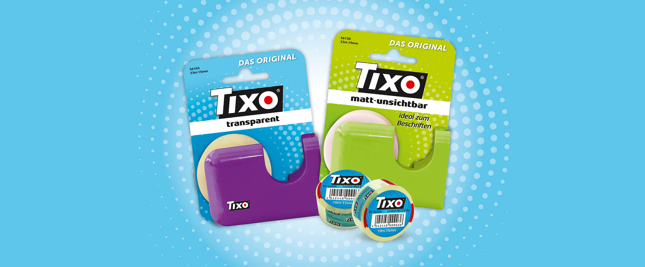
But also the TIXO products and their packaging design have been modernized: The clear separation of the qualities by means of color codes in transparent and matt-invisible makes selection for consumers easier and helps with handling. Consistent and clear communication on the packaging provides benefits to consumers, such as the reference to promotion or eco-labelling. Claus Grobe, Managing Director of tesa GmbH, commented: “The new, uniform branding and the clear differentiation of the varieties allow the consumer to better perceive the different qualities. In addition, we are gaining a clearer recognition at the POS by revising the packaging and the new colors.”
Mag. Claudia Schefberger, Trade Marketing Manager at tesa GmbH, is pleased: “In our view, this relaunch is a particularly successful combination of preservation and renewal of already learned design elements. Mark & Mark has optimally implemented our idea to give the known a fresh coat of paint. With this cooperation a promising relaunch of the TIXO brand succeeded.”