The Power of Design
supports your Wellbeing

ÖKOPHARM

From strong product brands with an insignificant producer to a great umbrella brand.

In the first design step, we developed a new word-image brand and significantly increased its conciseness and independence.

The Ökopharm "Ö" symbolizes the start button, which gives the brand energy and functional power. The abstracted leaf represents the naturalness of the products.

The particular challenge of the packaging relaunch was to change the hierarchy of design elements in line with the brand strategy, without jeopardizing recognizability.
This was especially important for Immun44, the clear market leader in nutritional supplements.
Therefore, we decided to include the people image in this product, but changed it up a little and placed it on the Ökopharm-typical, soft green background and slightly revived the two people.

The graphic bracket in the form of a rider system in the newly defined Ökopharm-green gives the package a certain dynamics and ensures strong shelf effect and differentiation.

Customer:

SANOVA PHARMA GmbH

What we have done:

BRAND STRATEGY
BRAND DESIGN
PACKAGING DESIGN
ADVERTISING

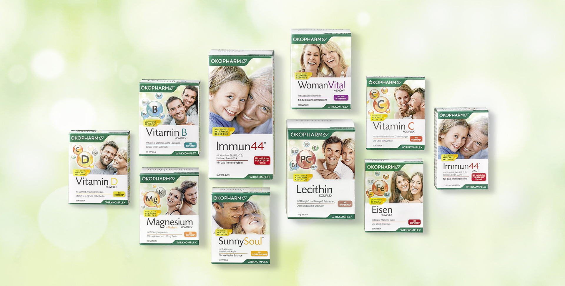
CREATING A NEW ROOF BRAND AND
15 PRODUCT BRANDS WITH 40 ITEMS IS MASTERED BY VERY FEW AGENCIES IN THIS QUALITY. MARK & MARK COMPLETED THIS TASK BRILLIANTLY! THE EXTREMELY POSITIVE FEEDBACK OF THE PHARMACIES REGARDING THE NEW PACKAGE LINE CONFIRMED THAT WE HAVE CHOSEN THE ABSOLUTE RIGHT AGENCY. PROFESSIONAL, IN REGARDS OF BOTH FUNCTIONAL AND HUMAN ASPECT.

MICAELA HUSNY, HEAD OF MARKETING ÖKOPHARM