THE POWER OF DESIGN
PLAYS A MAJOR ROLE IN
CREATING GENERIC BRANDS

TIXO

Redesign of a cult brand that has already become a generic term for tapes in Austria.

We approached this task with the utmost respect. The basic structure of the brand was retained in order to cause no emotional rejection among the Austrians. The new typography adds modernity and makes the brand name more legible. The sparkling idea: The previously oval "o" becomes round and receives a red center. The new "o" becomes the symbol for all Tixo products and gives the brand new appeal. But also the packaging design of the entire Tixo product range has been modernized and restructured. The clear separation of the qualities by means of color codes in transparent and matt-invisible makes it easier for consumers to choose from the variety and helps with handling.

Customer:

TESA GmbH

What we have done:

BRAND STRATEGY
BRAND DESIGN
PACKAGING DESIGN
ADVERTISING

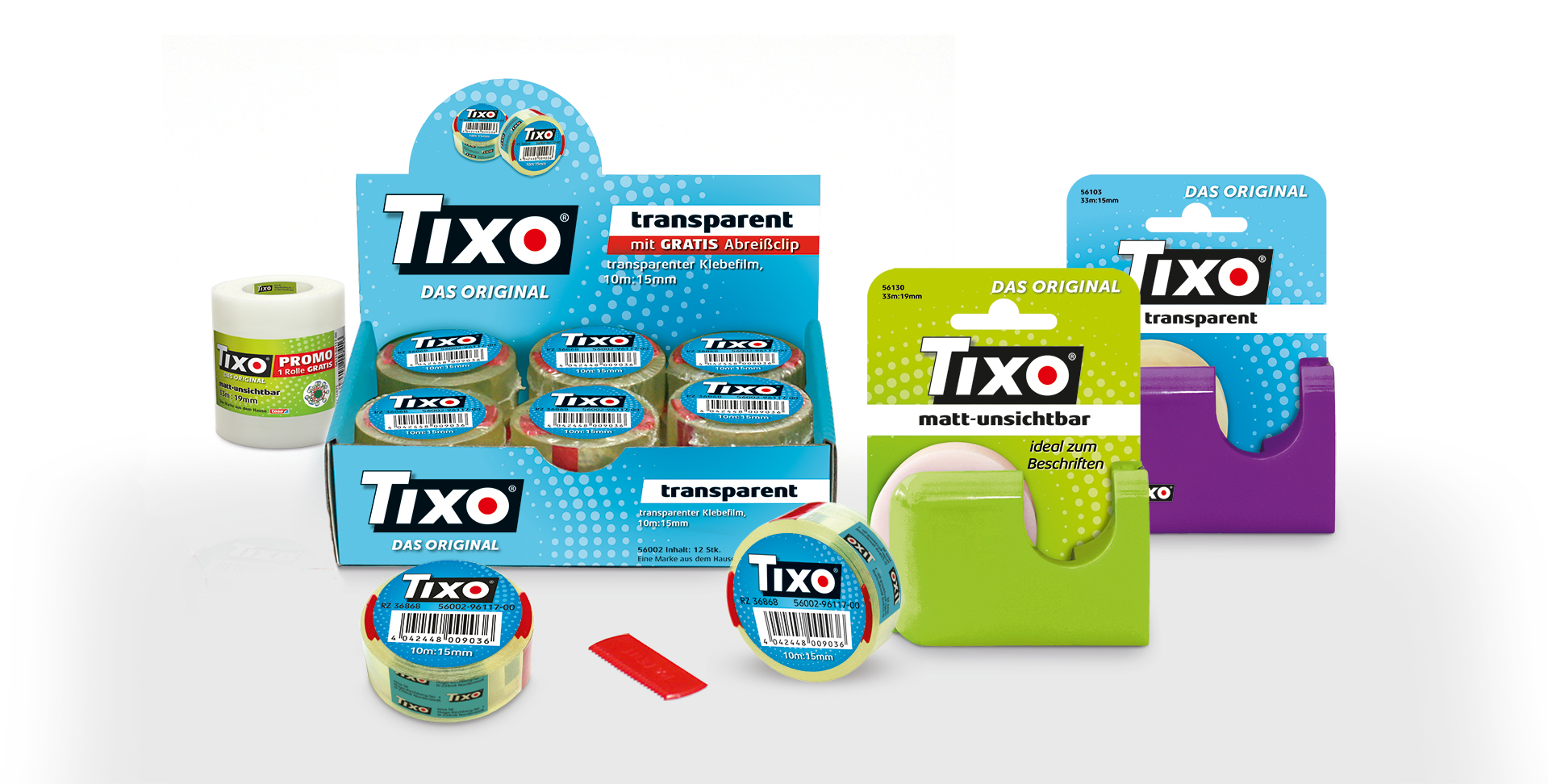
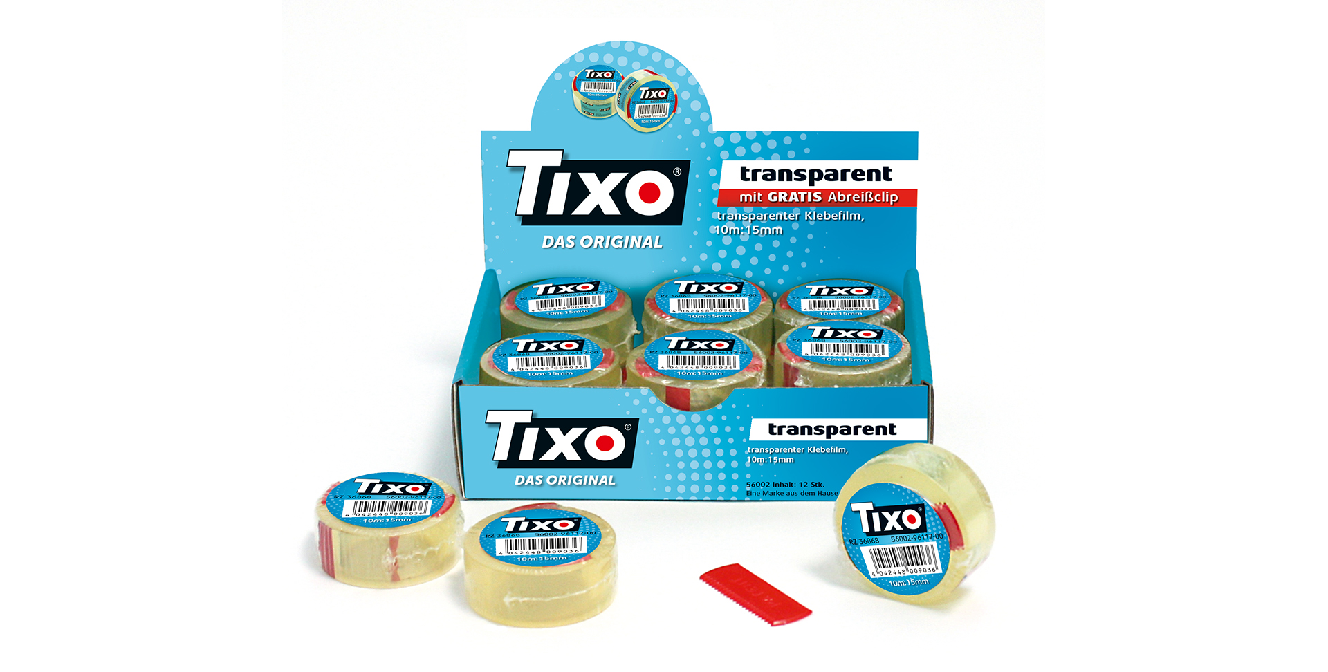
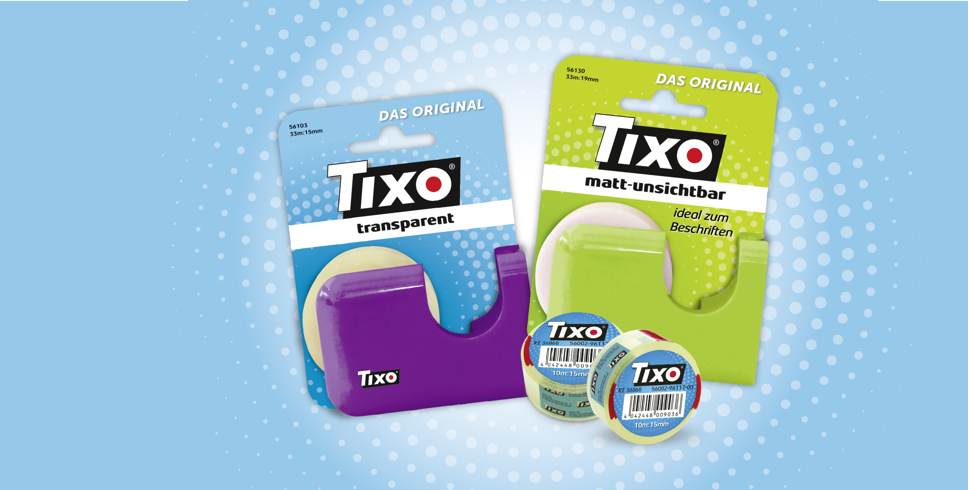
In our view, this relaunch is a particularly successful combination of preservation and renewal of already learned design elements. Mark & Mark has optimally implemented our idea to give the known a fresh coat of paint.

Mag. Claudia Schefberger, Trade Marketing Manager